
Green with envy, rolling out the red carpet, feeling blue. Colour has an important role in our lives. It helps convey emotion and impacts our moods and minds.
Different hues make us feel different ways. Colours in your home can influence your behaviour, sleep, moods, and even your decisions. And, because our kitchens are the heart of our homes, the kitchen colour palette will have a massive impact on us, our families, and our visitors.
So, exactly how should you go about choosing the best kitchen colour scheme? One that suits your home and your personality. Do you show your true colours by sticking to your personal favourites for a timeless look? Or should you follow kitchen colour trends when it comes to the perfect palette?
Here are our suggestions for picking the perfect colours to feature in your kitchen.
The quick guide to choosing a kitchen colour palette
Before you break out the colour swatches or paint samples on the wall, consider these questions when it comes to picking a kitchen colour palette:
- What size and style of kitchen do you have?
- What mood do you want your kitchen to set?
- How much natural light does your kitchen receive?
- Will you change your mind, or will it negatively affect the value of your home if you decide to sell it?
Set the mood with the right colour palette for your family
Consider the following colour ranges to create different atmospheres for your space:
- Neutrals: White, beige, and cream make a space feel relaxed and welcoming.
- Blue tones: Even in dark hues, blues (and greens) help create a soothing, grounding space.
- Red spectrum: Reds, pinks, oranges, and yellows are stimulating and welcoming colours that will help add warmth.
Mix it up: Tips for kitchen colour scheme coordination
The short answer is to get yourself a colour wheel! Using a combination of different colours in your kitchen scheme doesn’t have to be guesswork if you follow the technique of using colour principles to establish which colours will work together.
You might choose to combine different tones of a single colour, use colours that are close together on the colour wheel, or choose complementary colours that contrast because they sit at opposite ends of the colour wheel.
Choosing where to add colour in your kitchen
Different kitchen styles lend themselves to different colour schemes, but if you’re willing to think outside the box, you can find the best kitchen colours for your home without compromising on personality. Here are some obvious and not-so-obvious ways to add a splash of colour to your space.
- Splashback: Whether you choose colourful patterned tiles, warming brick or funky granite, durability and ease of cleaning are still the most important factors in a splashback. Forget the stainless steel and try running the benchtop all the way up for a cohesive look. Or, add big impact with an unexpected mosaic pattern. Either way, the splashback is a simple and often inexpensive way to create a wow factor with colour.
- Colourful appliances: From orange fridges to yellow toasters, appliances are more of an investment than paint colours, so be sure you have the balance right if you choose bright pops of colour for your scheme. The good news is that using appliances for personality-driven kitchen colour schemes means if you decide to sell and take your appliances with you, the new owners will be able to add their own style.
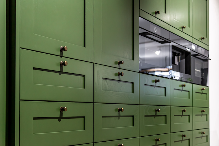
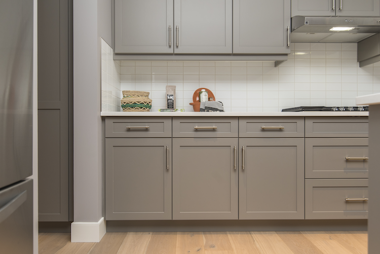
- Cabinets and shelving: Cabinetry comes in a huge range of colours, but if you fear you might change your mind about your kitchen colour scheme after a few years, choose cabinets that can be painted to change the look of your kitchen completely. If you don’t want to display your love of colour on the outside, consider painting inside cabinets for a surprising accent. Or why not highlight your shelving with pops of colour?
- Benchtops: There’s no need to go overboard here. Neutrals can have colour too. For example, benchtop materials such as marble are available with a large amount of colour but still bring a look of sophistication to your home.
- Furniture and accessories: A non-permanent way to colour and add personality is to use dining tables and bar stools in different hues and textures, which can be easily swapped out over time. You can also use your walls to express your style, not just with paint colours but also with wallpaper or statement art.
- Fittings and fixtures: If you want a subtle colour accent, you might choose gold or brass tapware or lighting options such as pendant lights or sconces to contrast the tones in timber flooring. If you want to make a statement, consider adding colour where it’s not often seen by choosing colourful handles.
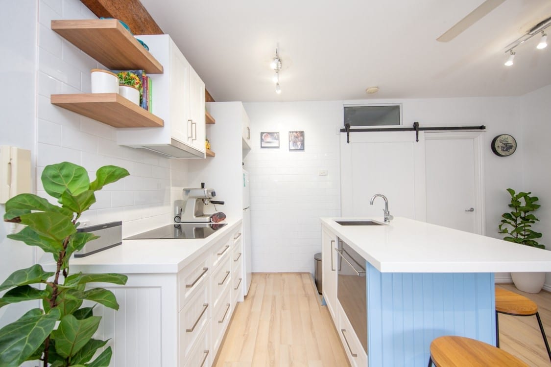
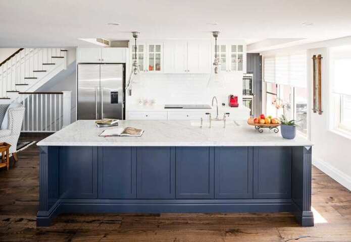
- Kitchen island: If you want to be just a little bit bold, contrast the colour of your kitchen island to introduce a new shade and make it stand out as a focal point.
Tips for choosing kitchen colour trends to follow
Follow kitchen colour trends with care. While it’s great to know what’s in style to ensure your brand-new kitchen doesn’t look dated, you’re better off picking a colour scheme that you’ll love for more than a season.
Here are the current colour trends for the kitchen, all of which are inspired by nature.
- Earthy greens: Forget sage green with its cold undertones. Darker olive or moss-tone greens take inspiration from nature to create a sense of harmony in the heart of the home. Calming and grounding, earthy greens complement other natural materials, such as wood cabinets and stone benchtops.
- Sandy beige: Classic and restrained, beige is back in a big way. A comfortable way to move away from whites without feeling too overwhelming, beige is the perfect neutral clay tone between caramel cream and the divisive orange terracotta.
- Bold burgundy: If the rest of your home features light neutrals, why not go bold in the kitchen? The perfect contrast to a cool marble surface or pairing with warm wood, burgundy is the new beige for those who aren’t afraid to be bold. It’s also a nice contrast to another on-trend colour — rusty, deep pink.
- True blue: Blue is a trend that isn’t waning. Deep blues are the ideal partner for the whitest of whites, but for a less nautical feel, try using an aquamarine hue instead of the popular navy blue. Softer and more serene, this shade should make you feel like you’re on a Mediterranean holiday rather than floating out into the deep sea.
- Rich grey: Embrace green and brown undertones by opting for darker greys in your kitchen design. Warmer than the cool greys of the past, it works best paired with similarly warm whites.
Inspiration for your kitchen design and colour palette
Cohesion. Coordination. Harmony. What every homeowner wants from their kitchen is a space that looks as good as it functions. At Easy Living Kitchens, we can help you with your kitchen colour palette choice and design a beautiful space. Because we understand, as well as offering timeless appeal, your kitchen should suit your individual needs.
From brand-new kitchens to kitchen renovations, we’re not like the others. We custom-design kitchens for your Brisbane home for all tastes and according to your budget. We work with you, helping bring your ideas together with all the elements that are needed for a great kitchen. When you contact us, we give you a free kitchen design consultation with our expert in-house kitchen designers. Choosing a kitchen colour palette couldn’t be easier with our one-stop shop that comes to you. Contact Easy Living Kitchens today on 1300 650 681.